Kineffex
Branding
Branding
Profile
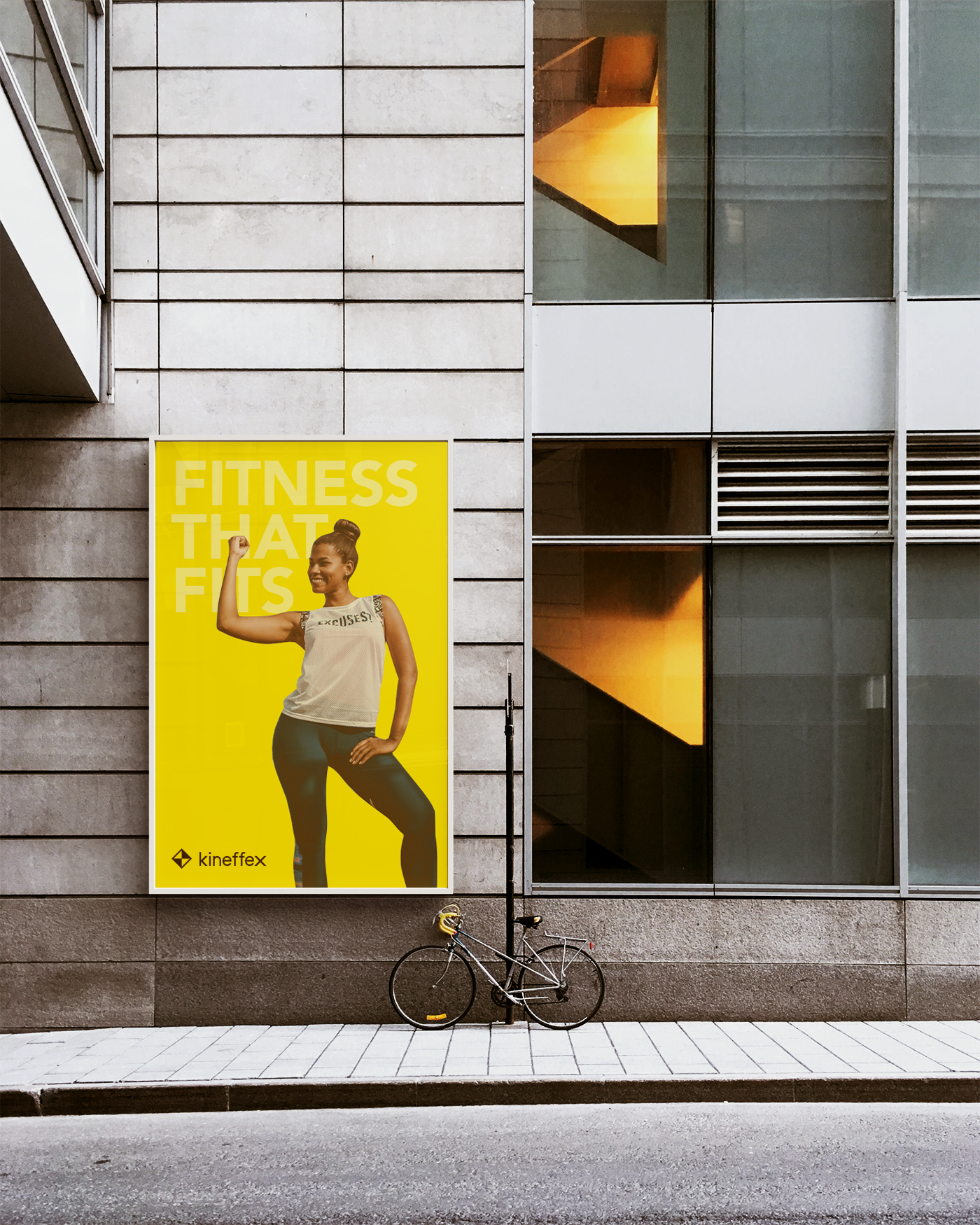
Kineffex is a fitness and health company established in 2015 based out of Pasadena, CA. The business wanted to brand themselves as a health-first fitness company. They were seeking to break away from the current trend of aesthetics driven fitness and focus on improving general health to promote longevity.
Kineffex is a fitness and health company established in 2015 based out of Pasadena, CA. The business wanted to brand themselves as a health-first fitness company. They were seeking to break away from the current trend of aesthetics driven fitness and focus on improving general health to promote longevity.
Objective
The goal was to create a brand identity showcasing Kineffex's mission statement of a health-first approach to fitness.
The goal was to create a brand identity showcasing Kineffex's mission statement of a health-first approach to fitness.
Strategy
Kineffex is short for Kinetic Effects which represents the positive effects of a body in movement. The brand will be designed around the idea of movement.
Kineffex is short for Kinetic Effects which represents the positive effects of a body in movement. The brand will be designed around the idea of movement.


Logo
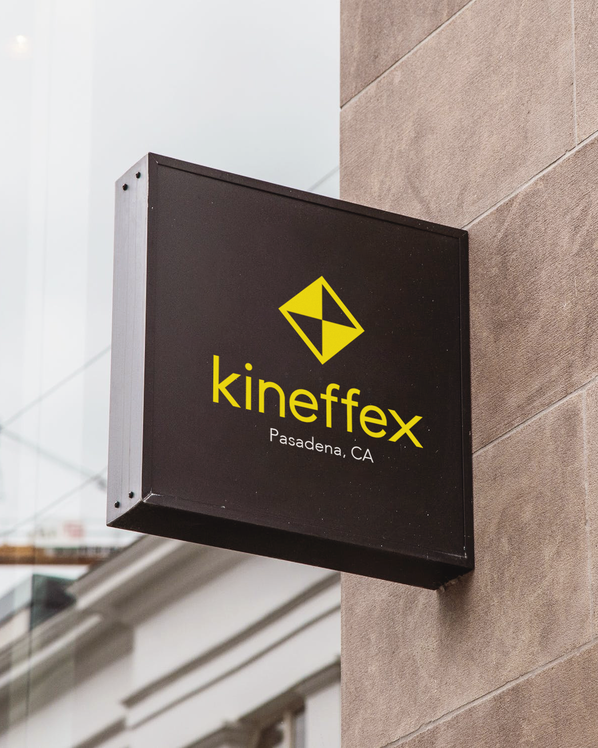
The approach to the logo design was based on arrows representing the direction in which the body moves.
The approach to the logo design was based on arrows representing the direction in which the body moves.
Logo Concept
Color Palette
Yellow was chosen as the primary color because it represents energy and positivity. Black was chosen as the secondary color to balance the vibrancy of yellow as well as representing balance.
Yellow was chosen as the primary color because it represents energy and positivity. Black was chosen as the secondary color to balance the vibrancy of yellow as well as representing balance.
Colors & Font Family
Personal Trainer Uniform


Icons
